Fabian Oefner

|

|

|
Oefner is a contemporary visual expression artist of the invisible effects of the natural sciences and the properties of time is the genesis of his photography, film and kinetic installations. Born in 1984 and grew up in Switzerland.
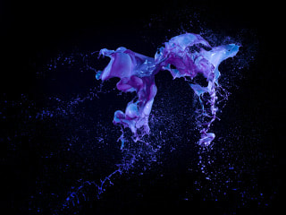
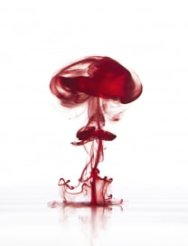
I have been looking into different photographers that experiment with colour and I have found that Oefner best show how colour can be experimented with, these images each show a different technique in which colour has been experimented with, such as sound, oil and water, bubbles and high impact causing explosions. His work has given me inspiration to complete experimental shoots such as my shoot in which I used colour to capture sound (shoot name-sound captured) . the middle image of the three chosen above is the image that gave me inspiration for my sound captured shoot, Oefner used coloured crystals on top of a speaker which when the music is played the crystals bounce up, which is how the sound can be captured. The lighting that may have been used to create these images could of been either spotlight or flash as the objects are the only thing that is being highlighted in the images, the black background also helps the main focus of the images such as the paint or crystals.
The left hand image is what I feel to be my favourite image at I feel it shows many different techniques to be able to get the effect that has been created. He makes the image feel as though the colour has just exploded out of the background giving the image a mysterious look to it. A photographer tat I feel creates a similar effect to this is Alex Koloskov, as his images also give a mysterious feel to them as well as the objects look as though they are coming out of the background.
http://fabianoefner.com/
Alex Koloskov


|
|


'commercial photographer, co-founder and teacher at photigy photography school.' "it allows me to experiment, to see outside the boarders to challenge the authorities and slow create a stunning photography style that is crisp, sharp and crystal clear."
Koloskov is an experimental photographer who has used paint within his images to capture movement. In two of these images Koloskov has thrown the paint and then captured it as it is moving, it looks as though he has stopped time and travel of the paint, he has also then used objects that also show movement, as well as throwing the paint he also used objects such as flowers and masks to also show the movement by spinning the objects the paint fly's off giving the objects a scene of movement and also helps to give the images an abstract look to them. I feel that the abstract of the images helps to hind the objects of what they are so the it gives the viewer a moment to guess what has been used, although some are more obvious then others. flash or spotlight could have been used to capture the images and highlight the main focal point within the images.
The movement of these image make normal objects look as though that they have movement to them giving the images more of an interesting look instead of the objects just being covered in paint. my favourite image within the collection of images that I have chosen form this photographer is the image in the bottom left as it shows all of the colour coming off of the flower giving the image more of an interesting look rather that just being a painted flower also giving the image a sense of movement.
http://www.koloskov.com/
Joseph desler costa

|

|

|
Costa uses Photoshop and this allowing the effects of his image being able to be achieved, such as the objects being layered on top of the coloured layers. This technique gives his images an abstract and colourful look, as well as the images being given a three dimensional and pop arty feel. The first image shows this 3D effect that i feel can be seen, as the objects within the image are really made to pop out of the image giving it more of a realistic view.
With the last image, Costa has shown his layering technique by placing the colour layer over the top of the object that has been used (statue), the image is dark in comparison to the other two images, however this i feel makes the object still stand out of the image without the colour being to bright and a main focus point of the image. Although the colours in the image are vibrant they do not distract the focus from the objects that have been used, i feel that coloured layers make the objects stand out even more and giving the three dimensional look. In the middle image the blocks of colour that have been layered together create many different colours and shades where the colours overlap each other. a shoot I have done 'layers' also does this, the 4 colours originally used give the images more colours without having to add them.
The image that stands out most for me is the one on the left as although the colours are bright and solid in the background the main object still stands out of the image.
https://www.josephdeslercosta.com/
Brad Carlile

|

|

|

Within these shoots, Carlile explores the realities with light, colour and changes over time. He uses the sun to help with the effects that he is able to achieve. The images from his series ‘Day Amalgam’ he explains that he was able to capture details that are usually lost with most still images, Carlile uses ‘natural objects that are in their natural colours, while active elements become vivid colours’. This series is showing the passing of time and man’s relationship with nature.
Within another series of his images, ‘About Flow’ of which he focuses on the flow of water, clouds and people. He emphasises the images in biologically elemental colours. With the active elements, become more vivid colours then the stationary objects that are in their natural colour.
No digital manipulation is used to create his images; he uses a camera on films meaning that he is able to capture the energy changing.
he is able to turn images that would be a normal and/or a normal everyday image into an image that shows bright range of colours as well as giving the images more of a meaning such as a fairy tale or unrealistic look using real objects and settings.
http://www.bradcarlile.com/
Andrew G. Hobbs

|

|
Hobbs uses colourful gels to get the colour effects that can be seen in these images, as well as monochrome, hard and soft lighting. Within his images, it can be seen that he is able to draw out the emotion from his subjects from their faces, body and the gestures they make, this then I feel gives each image a different meaning or feeling. With the use of the colourful gels the lights are shone onto the backdrops so that the colours are not the focus of the images, but make the models stand out the colours also blend to create different colours and shades. The colours also soften the gothic feel from the clothes in the shoot; however, the lights are very subtly making the models hair the shade of the colours that are being used. The colours also blend to create different colours and shades.
http://andrewghobbs.com/
http://andrewghobbs.com/
both photographers Hobbs and Carlie have used colour within their image but instead of having the colour as the background such as Costa they have used colour throughout there images. Hobbs has used colour that is used and seen going over the top of the models and Carlie has used colour within the main parts of the images such as the water and the clouds.
Richard Foster

|
|

|
Foster has many different techniques and themes of images that he uses many of which have the use of colour within them. all of his shoots are taken in the studio this therefore means that he is able to control what his image will look like and not leaving the end result in his images being let done to chance. Foster shows that he experiments within his images by the use of the ink in the water and the paint that is dripping down from what looks like a white cylinder of which helps with the effect that is given. another effect that he uses is the use of still life, within these images he has used shadows to create the background of the images he also uses a subtle hint of colour which although is not a huge amount in the images it still stands out and creates the main focus of the image. he also uses another image or light to show the colour that he has used within his images for example the images that are advertising a perfume such as the blue flower that has been used in the first image that i have chosen of his.
www.richardfoster.com
www.richardfoster.com
Giorgio Cravero


|


|


|

A still life and architectural photographer working in Turin. He moves between traditional, digital as well as new technologies. To emphasise and communicate his images he uses several techniques such as light and other materials.
Cravero created a fine art project using colour as his main theme, there is an image above of what he wrote about this piece of work.
He also uses colour within his other work in the form of still life, he uses vibrant and also dull colours within his work. although the dull colours can seem to be boring and have little interest within them they are useful in the fact that they bring out the vibrancy of the other colours but are still able to be seen.
Within the images that are from the colour project he has shown the colour being drained from the vegtables and fruit this gave the images a gradual colour as they go from back and who to a bright and vibrant colour at the bottom, with the middle being coloured but not being viberant to give the image the draining effect.
Although he only uses one object within his images they are still eye catching, this is due to the objects that have been chosen being bright colours or the mix of dull colours and viberant ones which give the image more of a mix of colours.
My favourite image from the collection i have chosen above is the bottom left as i feel that the use of food representing a painters mixing pallet is creative and something that is not seen often. I feel that the meaning behind this image is that food is art and you can be as creative as you want with food. This is also an example of the mix of dull and bright colours bringing out each other.
www.giorgiocravero.com
